My Role
What I worked on
- Wireframing & UX Design — Sketched wireframes for all 6 core parts and worked with scrum master to align wireframes with our UML; designed the gamified home-page pathway, iconography, and locked/unlocked state system.
- Frontend Development — Templated views in Handlebars; built the Profile page end-to-end, including profile image upload and a profile image backlog.
- Testing & QA — Worked with another team member on Mocha/Chai unit tests for login; wrote UAT cases for error-state handling.
- Agile / Scrum — Tracked work as user stories with story points; ran weekly sprint check-ins with the team and TA.
- Visual Polish — Led a final UI consistency pass across every page.
The Problem
Why this app
Most fitness apps are built for people who already work out. RepQuest is built for people who want to get started, and want something to hold them accountable. Our target user is a college student in their late teens or early twenties who's never managed to stick with a gym routine before: motivated in theory, easily discouraged in practice by lacking methods to keep them on-track or gyms that feel unapproachable. Our team's vision statement put it plainly: a way to turn fitness tracking into something closer to a game than a chore, so showing up starts to feel like progress instead of an obligation.
- Gamified Progression — A winding path of levels to climb, that's meant to encourage a habit with visual progress.
- Daily Streaks — Visual proof of consistency, which provides a metric that's meant to motivate users to keep going.
- Unlockable Achievements — Badges tied to real milestones within various different categories: total workouts, muscle group, streak length.
- Low-Friction Onboarding — Clean UI, simple navigation, and legible type so first-timers aren't intimidated before they even start.
From Wireframe to Build
Wireframe vs. final
Home — the workout pathway
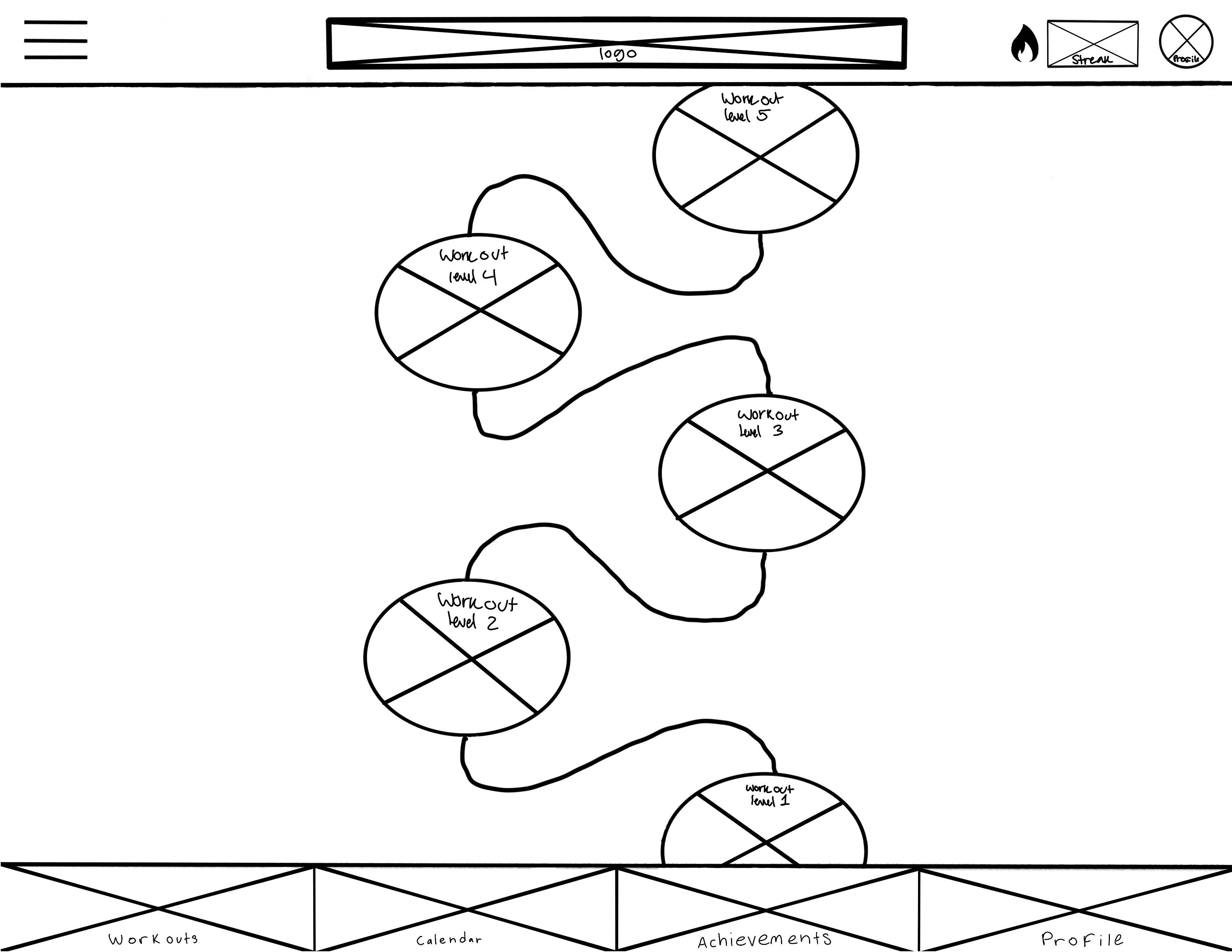
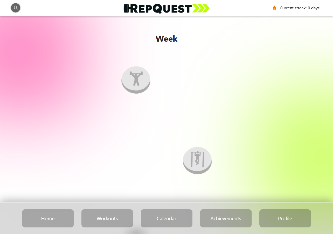
Shipped almost exactly as sketched. Only changes were: Hamburger menu → home icon; streak page fully scrapped → header streak counter.
Calendar
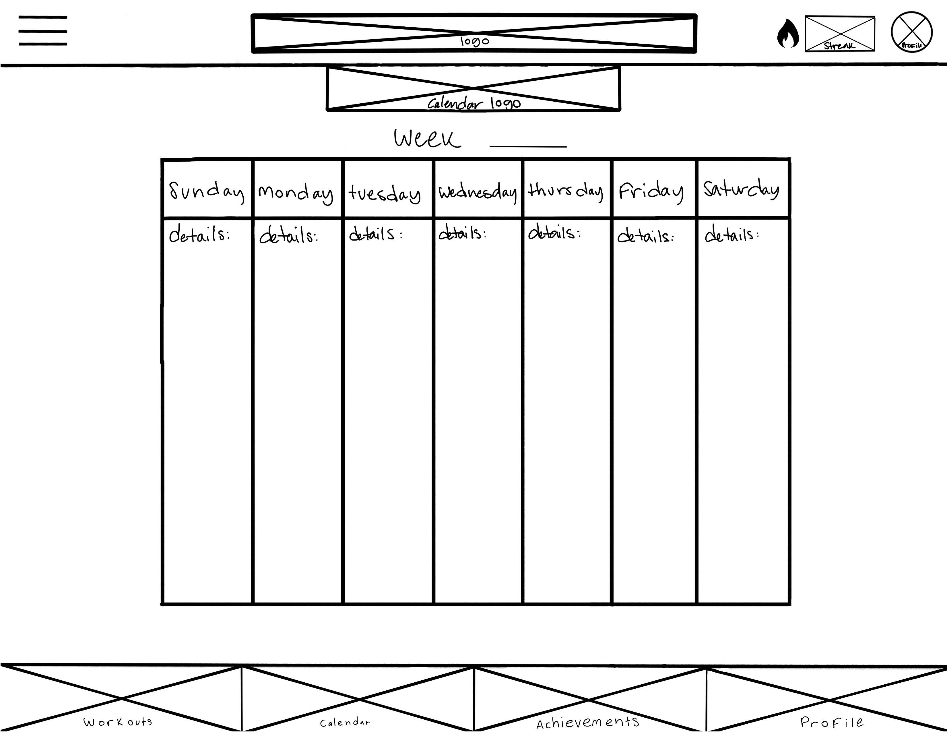
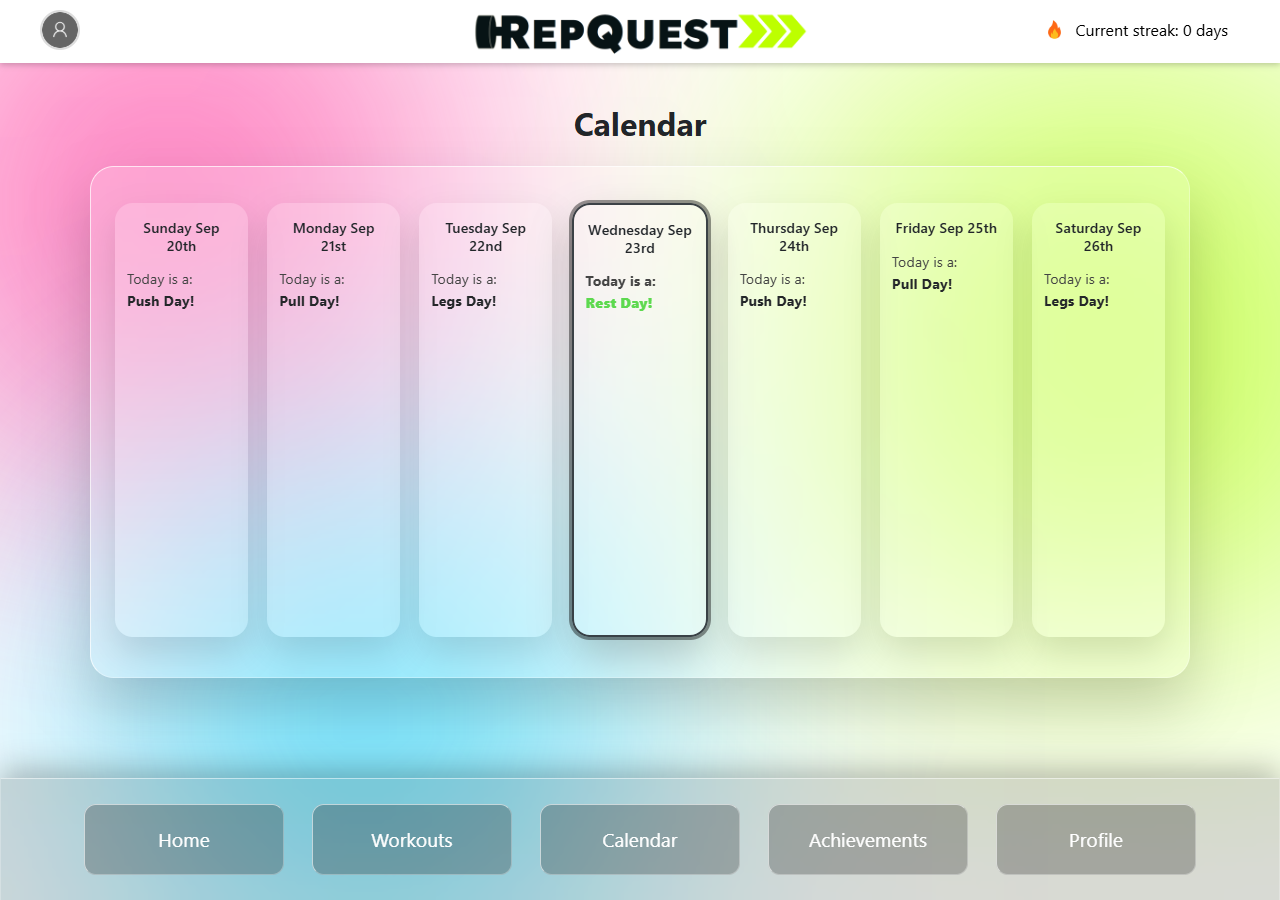
Same 7-day layout, now has real-time dates and push/pull/legs/rest data.
Workouts
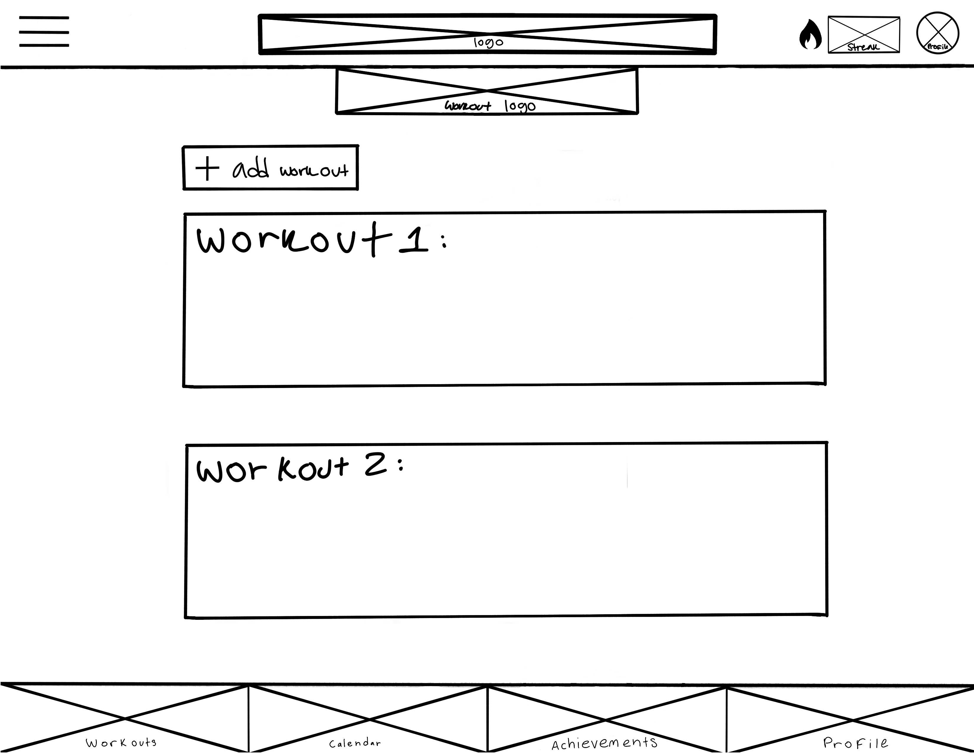
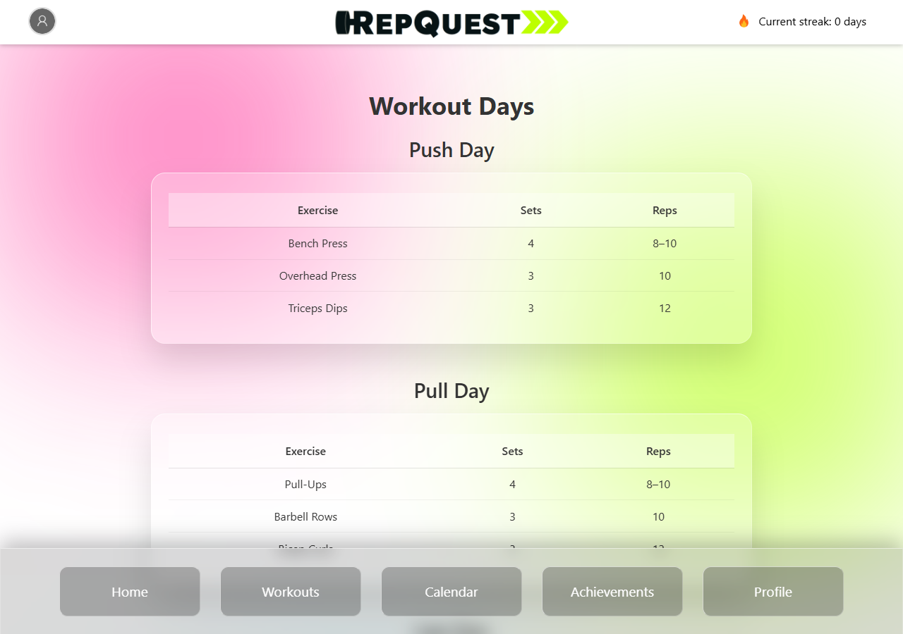
Empty placeholder blocks became real exercise tables with sets and reps.
Achievements
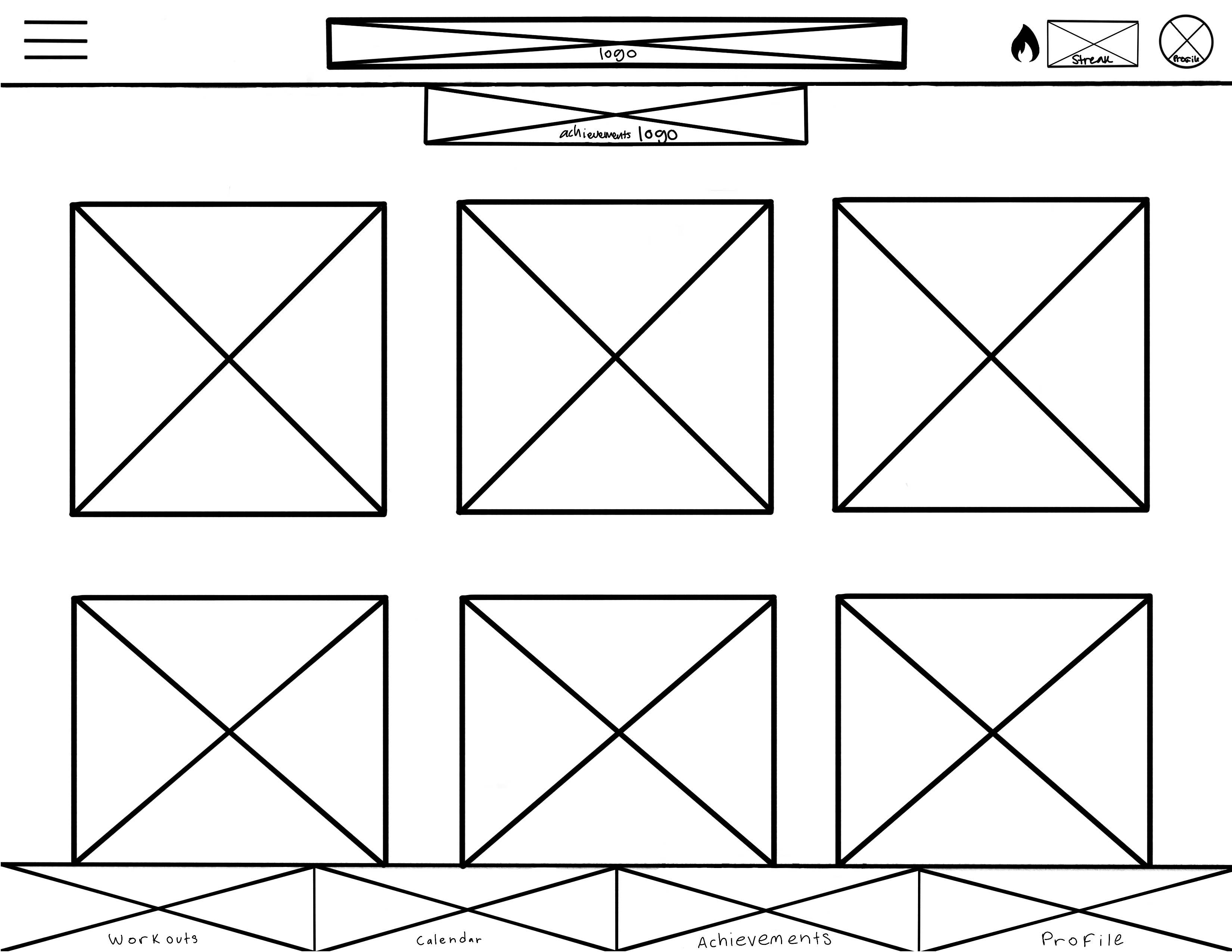
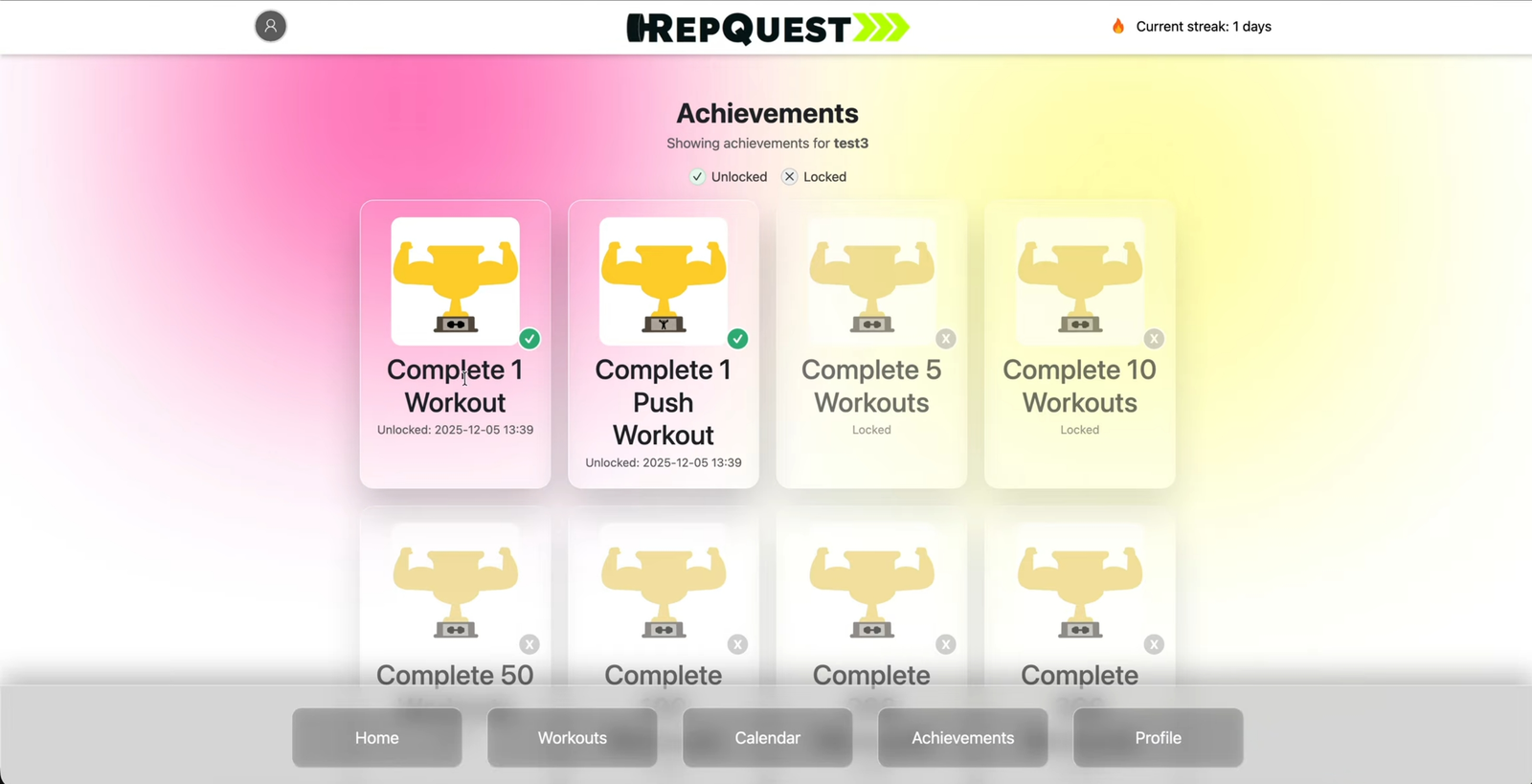
Fully personalized, trigger-driven badge system — unlocked badges light up in color, with the date earned.
Profile
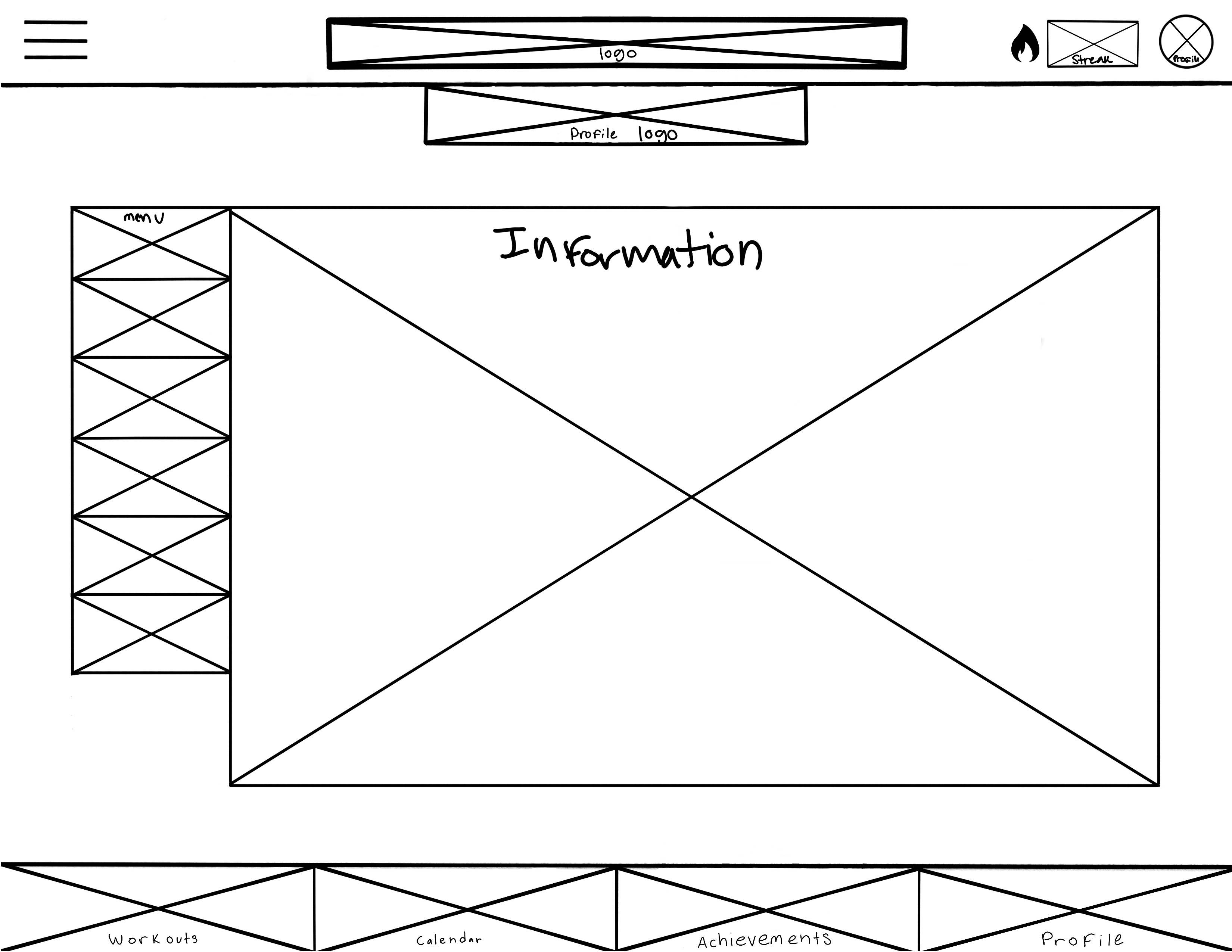
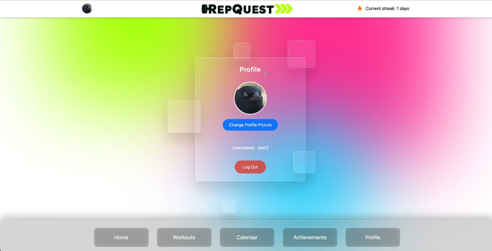
Built by me end-to-end, including the profile picture upload and a saved profile picture backlog.
Streak
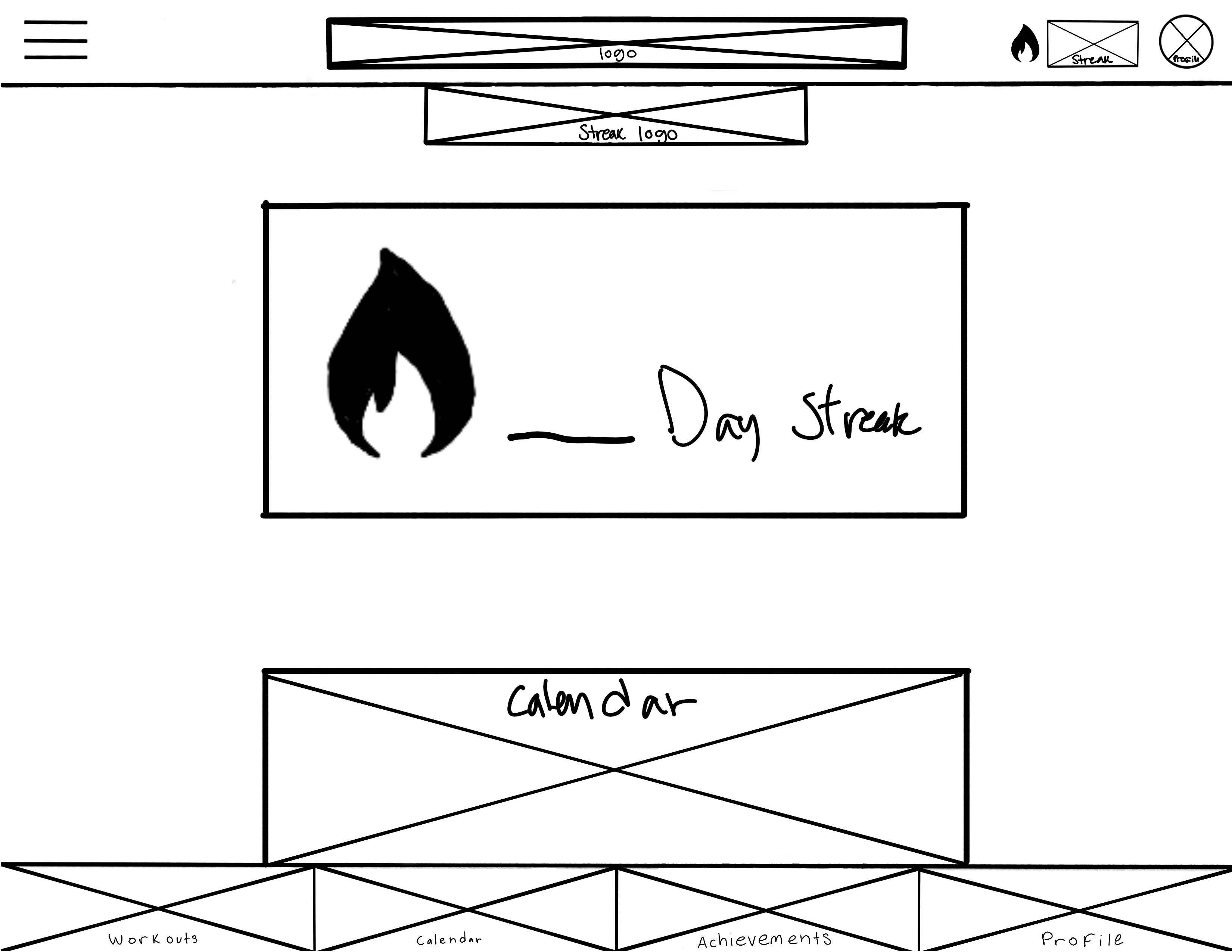

Originally planned as its own page and ended up embedded in the header as a counter instead, since the flame + day count said enough on its own.
UI/UX Design
Designing the visual language
Most of my day-to-day work on this project was visual design. I decided most of what a piece of state should look like before anything was properly implemented.
- Color-Coded States — Gray = locked, green = unlocked. A simple way to track progress visually.
- Custom Iconography — One icon per workout type (push/pull/legs/rest), reused consistently across the path, workouts, and achievements.
- Design System — One consistent visual language, making sure that a theme was maintained throughout.
Path Icons — Locked vs. Unlocked
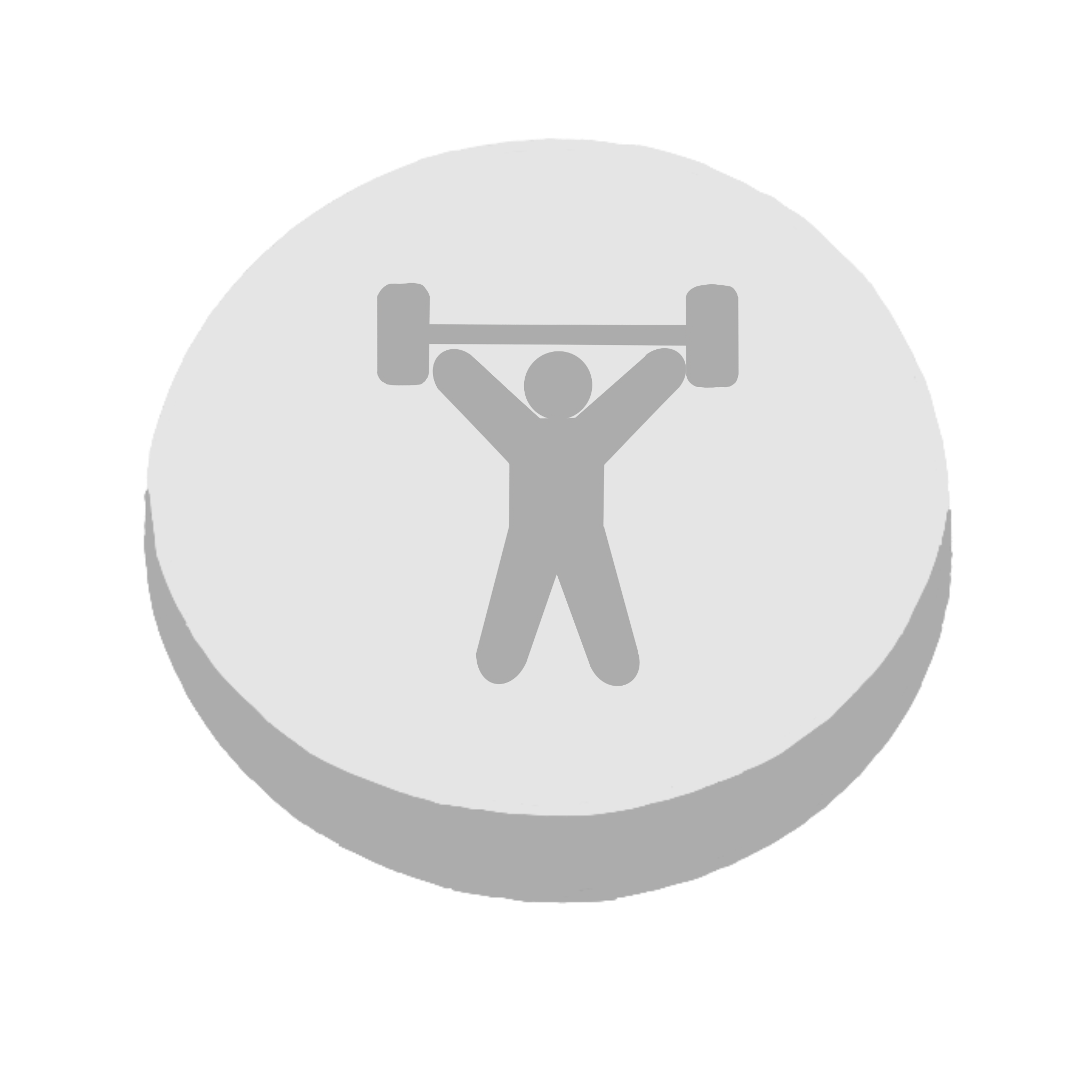 Push — Locked
 Push — Unlocked
 Pull — Locked
 Pull — Unlocked
 Legs — Locked
 Legs — Unlocked
 Rest — Locked
 Rest — Unlocked
Achievement Trophies
 General
 Push
Push Pull
Pull Legs
Legs Rest
Rest Streak
Brand Marks
 Logo
Logo Streak Flame
Reflection
Challenges & what I learned
For a 4 week long project, our team did a great job staying on track, and creating something we could be proud of. Besides that, there were some things we ran into and learned from:
- Responsive Design — Learning how to translate an app-style design onto a website. Our idea going into the project was that if we were to build on this project in the future, it would become a complete application. Obviously that did not happen, so we attempted mobile-driven design choices for a website instead.
- Scope Management — Sized sprints against real availability, not wishful thinking.
- Security Awareness — Flagged auth/DB risk early. (The real failure, months later: a free-tier expiration, not a breach.)
- QA — Wrote UAT cases for error-state handling across onboarding, calendar, and home.